Logos
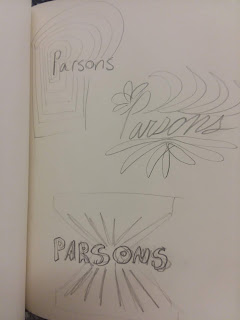
When creating a logo that was meant to represent myself I wanted it to come across as something nostalgic and fun. I took inspiration from a sort of high school style of sketching like the kind of thing I would doodle in my notebooks. Something simple, with an emphasis on line. I tried my best to keep the outcome simple and clean. I didn't want to over complicate things and end up creating something that wasn't authentic to myself. I found that working by hand came to be challenging when it came around to creating thin and consistent lines. I feel that the result is very representative of my tendency to be lighthearted. I found the videos interesting because I never really sat down to think of logos as art. They have to be completely representative of an entire brand in one set of simple shapes, lines. and colors. I found the videos to be informative, they taught me alot about branding as an art form I hadn't previously thought of in too much depth.


Your take on the logo project #2 was well crafted. The use of the primary colors really emphasizes a vibe of color itself since those three colors can make all
ReplyDeleteof the colors. It leaves the viewer feeling happy and warm because of the colors chosen. Its fun and I love how you took yours!!